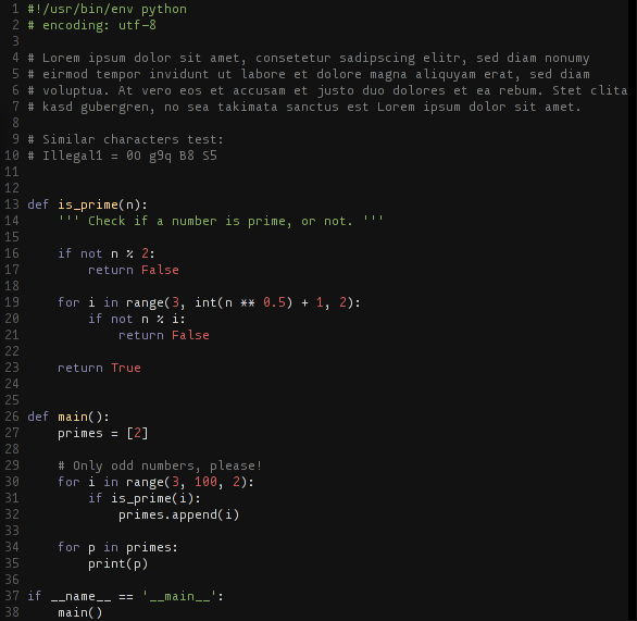
monoOne : A New Way of Looking at Your App Code
Thursday, September 26, 2013

|
Richard Harris |
monoOne is a monospaced font with over 300 characters, including the powerline symbols for programming and code review. "It slowly became a small, personal research-project to find a better programming font, exploring the
typographic needs of code display", says the creator.
Read more: https://github.com/madmalik/monoOne
The following specifications were used as guidelines in the development of monoOne:
- monospaced: this is the default for nearly all programming environments. Although there is some discussion if this specific feature is just historic ballast, the pro-monospace side argues that the possibility of lining up code and the resulting 2-dimensional structuring is useful. For me an even more substantial reason is that, in code, every character has potentially the same significance and should be given the same space to represent that. Giving every character the same amount of space facilitates reading on the character level and thus makes it easier to spot mistakes. Additionally it is a simple convention through all coding environments - the coder can be sure that her code will look similar for other programmers, even if they use another editor and typeface.
- must work well on low and high resolution displays: Right now we are in the transition to high resolution displays, bringing font rendering quality on screen to the realms of print quality. But we're not there yet, and especially on cheap laptops and typical office-displays this transition will not be accomplished in the foreseeable future. So the glyphs must survive being squashed into a grid of a few pixels extremely well, but I still wanted to design them with attention to detail, although it is only visible in print or on retina displays.
- differentiation of characters: every character must be clearly distinguishable from similar looking characters. While this seems obvious it comes with costs, like inferior long-text readability and a less consistent appearance. I wanted to reach this goal with minimal tradeoffs.
- visual representation of the coding mindset: Coding is the expression of ideas in a computer readable form. These ideas should be clear and condensed. The typeface that makes the code visible should reinforce this values. It should look clutter-free and open. This is arguably the least technical demand and the hardest to capture. Considerations regarding this point never beat the previous specifications, but every decision was evaluated under this aspect.
Read more: https://github.com/madmalik/monoOne

Become a subscriber of App Developer Magazine for just $5.99 a month and take advantage of all these perks.
MEMBERS GET ACCESS TO
- - Exclusive content from leaders in the industry
- - Q&A articles from industry leaders
- - Tips and tricks from the most successful developers weekly
- - Monthly issues, including all 90+ back-issues since 2012
- - Event discounts and early-bird signups
- - Gain insight from top achievers in the app store
- - Learn what tools to use, what SDK's to use, and more
Subscribe here


