

.jpg)
With Material Design Rules, Google Has the Upper Hand on Crossplatform UX
Monday, July 27, 2015

|
Guilherme Schmitt |
For a long time, the world of mobile platforms was based on two absolute truths – Google offerings were in the utilitarian realm – more capable yet not aesthetically pleasing – while Apple software had a more narrow feature set with a strong focus on user experience.
Recently however, those absolute truths fell apart. Google I/O 2014 saw the introduction of Material Design – Google’s guidelines for not only its web and mobile offerings, but for principles that could be applied on any device that could utilize its services.
Meanwhile, at WWDC 2014, Apple introduced iOS 8 with an expanded (and Android-inspired) feature set – third-party keyboards, widgets and app extensions, just to name a few. And while OS X Yosemite featured a new look “inspired by iOS,” it implemented conflicting rules on how things should behave and feel.
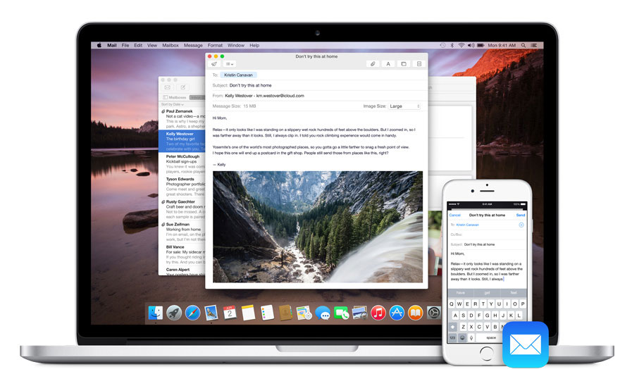
Cutline: iOS and OS X are closer than ever, but still exist under independent rules. (Source: Apple)
For digital platforms to truly coexist, Apple needs to go beyond the "inspiration" territory – and soon. If our content can now flow seamlessly between our devices, why can't digital environments also adapt to whatever format we prefer to interact on to consume information? Sure, each device has its own needs in relation to UX, Microsoft learned this lesson very well, but the utopian vision for the future was laid out: the digital convergence of platforms is coming.
While Apple makes it easy for its cross platform users to go from iPhone to Mac with Continuity, by not having guidelines that address the platform A-to-platform B transition, iOS and OS X designers are left in the open. Even Apple doesn't seem to know how to address this dilemma. For example, Cloud.com apps look similar to their iOS versions but very different from their OS X counterparts, even though they are meant to be used on desktop computers. It just doesn't work.
Google's Material Design established platform-independent guidelines that guarantee your content and the environment around it is consistent. Consistency is paramount to great user experience – it frees the mind and helps it focus on the task at hand, unhindered by disparities and striking differences that can distract users.
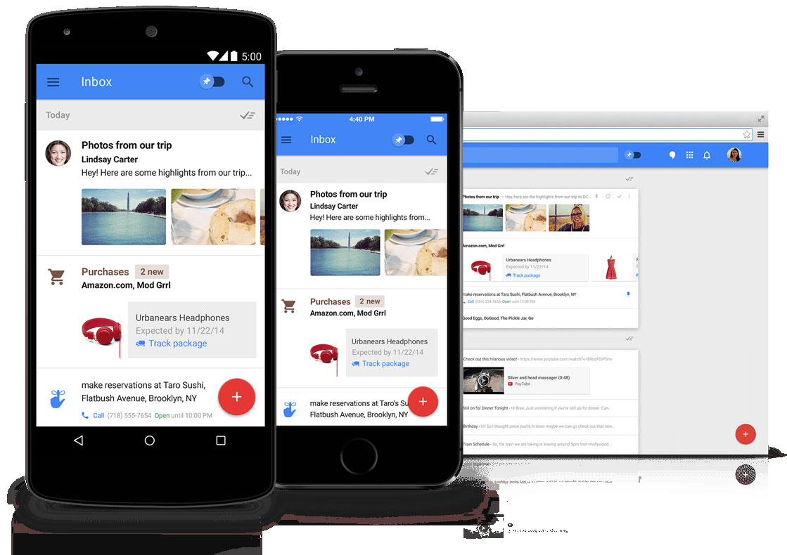
Cutline: Google's Inbox - users can learn how things work once, and apply that everywhere. Source: (Google)
Going Material
What can we learn from Material Design? Android, iOS and web app designers alike who are aiming for a better cross-platform experience, should embrace key Material techniques, or run the risk of rolling out inconsistent apps that will quickly lose their foothold in the App Stores:
- Design goes beyond what’s currently visible: Don’t ignore white space, analyze how its use can enhance the content that surrounds it. Make meaningful visual choices that not only please the eye but also consider hierarchy and focus;
- Acknowledge the Z-axis: Depth is essential to the design. All graphical elements in Material Design exist in a consistent 3D space, following rules of light and shadow. Elevate prominent actions in relation to other elements, their shadows will convey their affordance;
- Animation is a design tool: Use motion not only to bring delight, but to reinforce hierarchy, and provide a sense of place in the environment.
- Material is tangible: Users should always receive a system response to their input.
- Imagery is more than decoration: Don’t be afraid to utilize expressive illustrations or photos to enhance the user experience. Ideally, they should also be context-relevant to the current task, aggregating value.
Adaptive is the New Responsive
Just like when the web went through a revolution as responsive design became a non-negotiable feature for all new websites; all existing digital platforms will be disrupted by users’ expectations for new, seamless and beautiful experiences. The future for interactive design will go beyond a single app, a single screen, a single device, or a single platform. Seamless user experience is the new responsive design.
By making Android UX inherently responsive – with adaptable designs and app controls that made ergonomic sense for big screens – Google was ahead of its time. Big screens soon came to iOS, but nothing changed at all on the UX of the platform "made for your thumb" (and no, "reachability" is not a solution).
With Material Design setting the stage for a seamless cross platform future, the absolute truths for mobile have changed. Google now leads the way in future-thinking UX. Apple – it’s time for your move.
Read more: http://intrepid.io/
This content is made possible by a guest author, or sponsor; it is not written by and does not necessarily reflect the views of App Developer Magazine's editorial staff.

Become a subscriber of App Developer Magazine for just $5.99 a month and take advantage of all these perks.
MEMBERS GET ACCESS TO
- - Exclusive content from leaders in the industry
- - Q&A articles from industry leaders
- - Tips and tricks from the most successful developers weekly
- - Monthly issues, including all 90+ back-issues since 2012
- - Event discounts and early-bird signups
- - Gain insight from top achievers in the app store
- - Learn what tools to use, what SDK's to use, and more
Subscribe here


