New Google android wear smart watch OS
Tuesday, March 18, 2014

|
Richard Harris |
Everything You Need To Know About the New Google Android Wear Smart Watch OS Launched at the Game Developers Conference
Google likes to be front and center during major developer events and so after announcing new Google Play Services on Monday, on the second day of the GDC they have announced their new Android Wear OS for smartwatches and other wearables. And if you want to know everything about the Android Wear from an app developer standpoint, you’ve come to the right place.
The Android Wear Developer Preview provides tools and APIs that allows developers to enhance app notifications to provide an optimized user experience on Android Wear.
With the Android Wear Developer Preview, developers can: run the Android Wear platform in the Android emulator; connect an Android device to the emulator and view notifications from the device as cards on Android Wear; try new APIs in the preview support library that enhance an app's notifications with features such as voice replies and notification pages.
Signing up to the preview provides access to new notification APIs in the preview support library; sample apps using the new notification APIs; and access to the Android Wear Preview app for a mobile device, which connects a device to the Android Wear emulator.
The current Android Wear Developer Preview is intended for development and testing purposes only, not for production apps. Google may change this Developer Preview significantly prior to the official release of the Android Wear SDK. Developers are not allowed to publicly distribute or ship any application using the Developer Preview, as this it will no longer be supported after the official SDK is released (which will cause applications based only on the Developer Preview to break).
Before beginning the setup, developers must install the Android SDK which includes all the developer tools required to build apps for Android (optional IDEs are also available for download) then sign up for the Android Wear Developer Preview. Developers must sign up with a Gmail or other Google account in order to download the preview support library and receive access to the Android Wear Preview beta app on Google Play Store. For developers already using the ADT plugin for Eclipse, they must update to version 22.6.1 or higher.
New Smart Watch OS UI Model
A new form factor deserves a new UI model. At a high level, the Android Wear UI consists of two main spaces centered around the core functions of Suggest and Demand. An application will have an important role to play in both of these spaces.
Suggest: The Context Stream
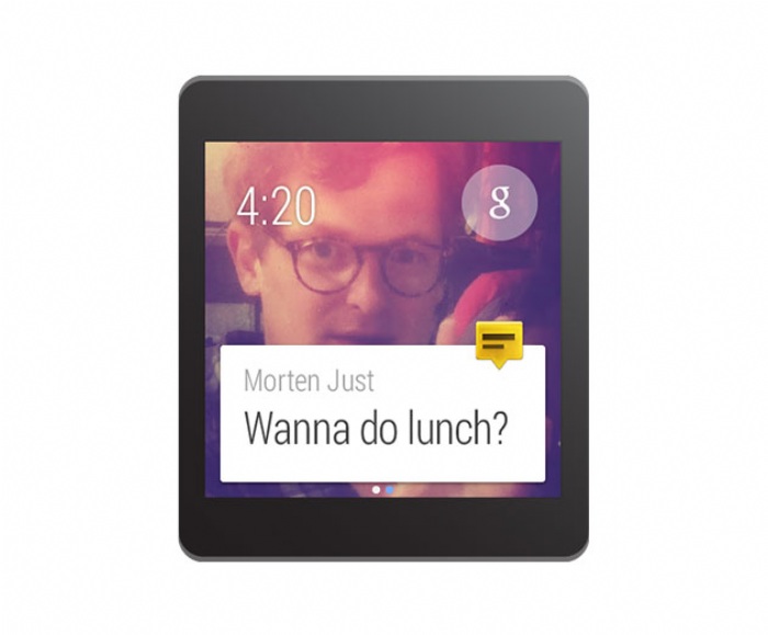
The context stream is a vertical list of cards, each showing a useful or timely piece of information. Much like Google Now on Android phones and tablets, users swipe vertically to navigate from card to card for a brief and comprehensive update about what's important to them. Only one card is displayed on the screen at a time, and background images are used to provide additional visual information. An application can create cards and inject them into the stream when they are most likely to be useful.
Cards in the stream are more than simple notifications. They can be swiped horizontally to reveal additional pages. Further horizontal swiping may reveal tappable buttons, allowing the user to take action on the notification. Cards can also be dismissed by swiping left to right, removing them from the stream until the next time they have useful information to display. In the emulator, hovering the mouse over the top of the screen illuminates a blue bar at the top of the device that takes you home when clicked.
Demand: The Cue Card
For cases where the context stream can't anticipate what the user would like to do, the cue card allows users to speak to their device. The cue card is opened by saying, "Ok Google" or by tapping on the "g" icon on the home screen. Swiping up on the cue card shows a list of actions, which can also be tapped.
The list of actions includes Android intents for voice actions. The upcoming Android Wear SDK will enable developers to match their applications to these intents so users can perform actions using these voice commands. Multiple applications may register for a single voice intent, and users will have the opportunity to choose which application they prefer to use.
Design Principles of Android Wear
Google wants Android Wear devices to provide just the right information at just the right time, allowing users to be connected to the virtual world and present in the real world.
Here are some guidelines for designing great user experiences on the Android Wear platform. Designing for Android Wear is substantially different than designing for phones or tablets, so we’ll start by describing how content can work in tandem with the overall Android Wear vision.
Android Wear experiences are:
Contextually aware and smart. These devices bring a new level of awareness to computing. Rather than requiring attention and input from users, Android Wear devices are aware of their situation and state, and helpfully display the right information at the right time. Timely, relevant, specific.
Glanceable. Wearable devices are used all throughout the day, even when they sit in our peripheral vision. Effective apps provide the maximum payload of information with a minimum of fuss, optimized to provide tiny snippets of relevant information throughout the day. Short, sharp, immediate.
Zero/low interaction. Staying true to the strengths afforded by a smaller form factor, Android Wear focuses on simple interactions, only requiring input by the user when absolutely necessary. Most inputs are based around touch swipes or voice, and inputs requiring fine-grained motor skills are avoided. Gestural, simple, fast.
Helpful. Android Wear is like a great personal assistant: it knows a users preferences, it only interrupts you when absolutely necessary, and it’s always on hand to provide a ready answer. Efficient, respectful, responsive.
By providing a smart connection to the rest of the world while respecting the user’s attention, Android Wear feels personal and global, simple and smart, unobtrusive and ever-ready. Notifications that respect these principles will feel most at home in the overall Android Wear experience.
Notification UI Patterns
Android notifications appear as cards in the mainstream and form the core of the Android Wear experience. Many of the main Android Design guidelines for notifications apply in Android Wear. Be respectful of users' attention and aware of how unnecessary interruptions will reflect on an application’s reputation.
Omit needless text from notifications. Design for glanceability, not reading. Use words and phrases, not sentences. The show, don't tell: where possible use simple icons, glyphs, and visualizations to convey the message.
In some cases, particularly with messaging applications, cards will contain dynamic content which may not fit on a single screen. In these cases, the content will be automatically truncated to fit on the card and the user may tap to expand, so the full message should be provided.
Notification priority should reflect the urgency of notifications, with only time-sensitive notifications carrying a high priority. Active notifications – that is, those that cause the device to vibrate – should only be used in cases that need the user's urgent attention or action (e.g. a time-based reminder, a message from a friend). Non-urgent notifications (e.g. a transit times card, daily pedometer count, social network updates) should be silently added to the card stream.
Actions
Actions appear to the right of notifications, allowing the user to act on the notification. Up to three actions are permitted. The most-used action should be placed first so that it is a single swipe away from the content.
Actions consist of an icon and a caption. Icons should be PNG files, white on transparent background, 64 × 64 DP. Captions should be verb-driven and short and will be automatically truncated at one line.
Actions are optional. Many useful notifications will not need to include actions at all.
Images
Images appear behind cards in the stream, providing context and additional glanceability. An image should support the core message of the notification; for example, a card about a sports team could include the team color and logo; a message from a contact should display that person's profile photo.
Bear in mind that the card will partially cover the lower part of the image. Images should be at least 320 × 320 pixels at hdpi. Image backgrounds move when horizontally swiped, so landscape-oriented images work better on notifications that include pages or actions.
To add large images, use setLargeIcon() with any notification, as shown in Creating Notifications for Android Wear.
Application Icons
An application’s launcher icon will be automatically placed on the card, identifying a notification. Do not use the notification title or background image to identify or brand an application. Instead, allow the app icon to identify itself and focus on delivering a clear, succinct message in the card and image. Developers can choose not to display this icon using setHintHideIcon().
Pages
Pages are additional cards that can appear to the right of a main card in the stream. If a core message is longer than a short snippet, do not sacrifice glanceability by packing a lot of information into the primary notification. Instead, use pages to provide additional content.
Pages appear immediately to the right of the main notification card. They are typically used to provide additional details or alternate views of the main card’s content. For example: (1) A current weather card might provide an additional page showing a three-day forecast. (2) A next train departure card might provide an additional page showing subsequent departures times. (3) A daily step count card might provide an additional page showing the same measurement in calories and distance.
There is no imposed limit on the number of pages that can be added. However, notifications that provide actions should show no more than three pages to ensure that the actions remain easily accessible.
Pages are optional. Many useful notifications will not need to include pages at all.
Notification Stacks
Stacks may be used to collect multiple notifications from the same application into a single stack of cards. Whereas pages are used to provide additional detail on a single notification, stacks are used to collect multiple sibling notifications together. A stack may be expanded by the user to access each individual card contained within.
Stacks are a way of adding multiple useful notifications without overwhelming the user’s stream. If an app produces multiple concurrent notifications, consider combining them into a stack.
Each notification within a stack can contain separate pages and separate actions that are relevant to that specific notification. The user can access these actions after expanding that notification's card within the stack.
Voice Replies
Voice replies are primarily used by messaging applications to provide a hands-free way of dictating a short message. Developers can also provide a up to five suggested replies or “canned responses” that are useful in a wide range of cases. These canned responses can be tapped by the user, allowing for a fast method of sending simple replies in cases where speaking may not be desirable.
Developers should attempt to cover a range of simple, neutral replies in their choices. Longer voice replies may be automatically truncated in the Voice reply UI.
Read more: http://developer.android.com/wear/preview/start.ht...

Become a subscriber of App Developer Magazine for just $5.99 a month and take advantage of all these perks.
MEMBERS GET ACCESS TO
- - Exclusive content from leaders in the industry
- - Q&A articles from industry leaders
- - Tips and tricks from the most successful developers weekly
- - Monthly issues, including all 90+ back-issues since 2012
- - Event discounts and early-bird signups
- - Gain insight from top achievers in the app store
- - Learn what tools to use, what SDK's to use, and more
Subscribe here



_cptybzmh.jpg)


